My Role, What I Did and Didn't Own
I was brought in to design the POS interfaces, not to lead research or strategy. The research and concept direction had already been shaped by the wider team before I joined. I received a research handover doc and was debriefed by the researcher. My scope was translating those findings into a working interface: how prompts surface, how staff respond to them, how the system handles rejection, and how the design evolves through pilot feedback.
That scope sounds narrow. In practice, interface decisions at this level of operational sensitivity, where the product interrupts a high-pressure, time-critical workflow on hardware you can't change, carry significant consequence. The design had a direct line to whether staff used the tool at all.
The Design Challenge
Inserting new UI into a system with no room for it. The POS was a single tablet-sized touchscreen already carrying four competing UI zones: live order items, item modifier options, category navigation, and payment totals. None of that could be moved or removed. I was working within an existing design system and fixed layout structure.
The hardware was touch-only, used by staff moving quickly under pressure. Touch targets had to be large enough to tap accurately without looking. There were no hover states, no secondary interactions, no room for anything that required a decision before acting.
Design Decisions That Mattered
Overlay, not inline
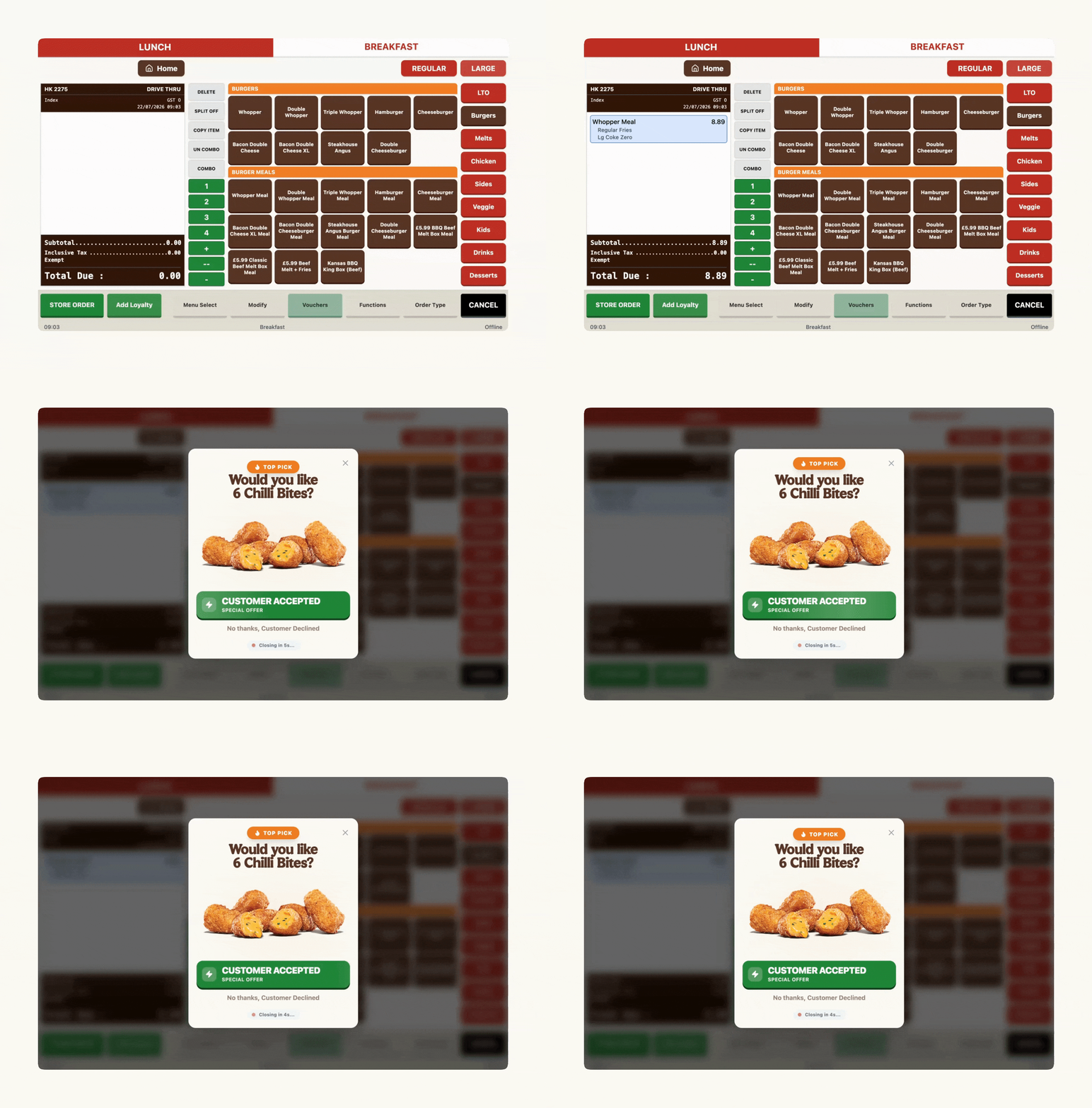
I chose a full overlay rather than embedding a prompt within existing UI zones. The layout had no available real estate, and a small inline element would have competed for attention rather than commanding it. The overlay creates a deliberate interruption: staff have to respond before returning to the order flow. Counterintuitive for a speed-of-service context, but the right call. Passive prompts that don't demand attention get ignored.
Asymmetric accept and decline
Accept and decline are not equal actions. Accepting adds an item and adds revenue. Declining closes the prompt and moves on. Accept is a large, filled green button, primary and confident. Decline is a text-style red link, present but not weighted. This asymmetry wasn't accidental. It nudged without forcing. In the evolved version, decline was softened further to plain text ("No thanks, customer declined") to reduce the friction of not accepting. This also handled the model's fallibility: when the AI surfaced a poor suggestion, an out-of-stock item, an odd pairing, a customer clearly not interested, the staff member could dismiss it in one low-effort action. Frictionless decline was the safety valve that let a probabilistic system fail gracefully in a live, high-pressure workflow.
Copy as a staff script
Early prompt copy described the product. Later iterations, informed by expeditor feedback in pilot, wrote the prompt as the exact words staff should say out loud: "Would you like [item] for [price]?" This removed the cognitive step of translating a product name into a natural ask. Staff could read the prompt and speak it directly.
Auto-dismiss countdown
The "Closing in 5s..." countdown in the evolved design meant staff didn't need to actively dismiss a prompt if the moment passed. Without this, a missed prompt required manual interaction to clear, adding steps to an already-full workflow. The countdown handled the exit gracefully. The countdown ran visibly on the prompt itself, a live "closing in 5s" state that let a missed prompt clear without a tap.
Price removed from the prompt
An earlier version surfaced the price prominently. We removed it, partly due to technical implementation complexity, but also because I felt it added a decision layer we didn't want staff carrying. The expeditor's job is to ask, not to pre-judge whether the customer will find the price acceptable. Price showed up on the POS receipt flow naturally.
The A/B and What I Learned From Being Overruled
We tested two significantly different visual treatments. I was tilting toward the more visually prominent, consumer-facing version: large product photography, stronger visual hierarchy, a more deliberate brand presence. My reasoning was that a bolder visual would command attention more reliably on a screen full of noise, and that product imagery would do selling work without adding copy.
The team went with the more functional, compact version. Their reasoning: it felt more native to a POS environment, less like a marketing interruption, which they felt would reduce friction with the existing order-taking mindset.
Outcomes
Results after 6-week pilot across 8 locations.
The attempt rate increase matters more than acceptance as a signal of design success. Acceptance depends on the customer. Attempts depend on whether staff found the tool usable and confidence-giving enough to actually use it. That ~15-point jump suggests the interface was doing what it needed to: lowering the barrier to trying.
Scope Boundary, What This Case Study Is and Isn't
Research, concept prioritisation, measurement framework, and pilot logistics were owned by the wider product and research team. My contribution was the POS interface design: how prompts surface, the interaction model, visual hierarchy, copy framing, rejection states, gamification, and iterative refinement through pilot feedback. I worked from a research handover and researcher debriefs.